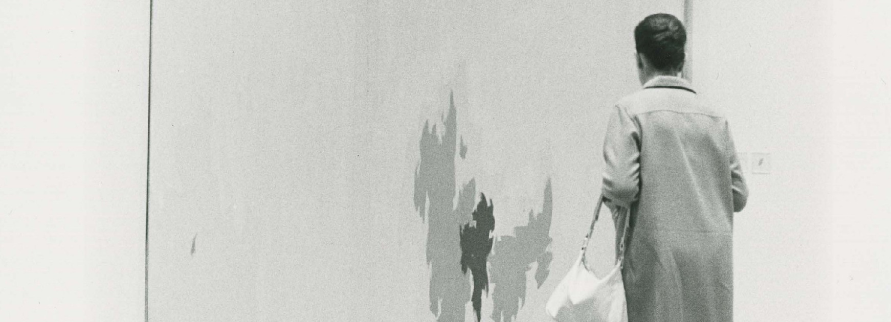
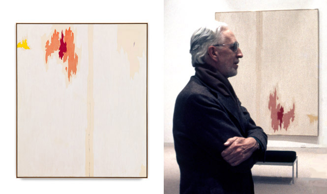
We’d like to know what you think. The photo below, on the left, shows how researchers have been advised to display Clyfford Still’s PH-847 upon consulting with Patricia Still, the artist’s wife and registrar. Her records as well as photos from the New York gallery of Sidney Janis—the first owner of this painting—show Still initially displayed the painting in this fashion. In the 1974 photo on the right, we see how the Hirshhorn Museum and Sculpture Garden displayed the painting later in the artist’s life, also with his knowledge. (That’s him in the photo.)
THIS POLL IS NOW CLOSED.
We received more than 200 responses to our questions regarding the orientation of Clyfford Still’s PH-847 of 1953. The following votes were cast:
Put the orange up: 116 votes
Keep the orange down: 85 votes
Here is a selection of some comments the Museum received with the votes. THANK YOU FOR VOTING!
Periodic, motorized reorientation would be the best display.
With the orange up I am less ignited, a bit sadder…if I owned it I’d prefer it this way. But I’m not gonna lie — I’d probably turn it around every so often.
It’s an interesting conundrum you have presented and one I am sure Still would have appreciated. For of course there is no “correct” way to view a painting and yet…there is an incorrect way.
I am an abstract artist and almost always put the ‘heavier’ or more ‘active’ elements of the painting at the ‘top’. I don’t know why, it just seems right to me.
Orange at the lower right feels more calm, solid. Top left gives it a sense of motion. At least for me.
“Orange Up” has more tension and energy…but “Orange Down” is more contemplative (if I was so lucky to have it in my home, then this is how I would display it). Just for fun, the sideways views each have their own sensation as well!