By Victoria Eastburn
During his lecture on Monday night, architect Brad Cloepfil joined us to discuss his process in designing the Clyfford Still Museum. He began by noting that many projects begin with a question: What can the architecture endeavor to reveal or serve about the location? What only the architecture can reveal, he said, leads the work. By focusing on the landscape, the Colorado plains east of Denver and the “awe and wonder” of basic elements like concrete, wood, and glass, Cloepfil created a building that utilizes one of Denver’s defining characteristics—sunlight— to showcase our own beautiful light as revealed through the building while simultaneously giving Still’s work its own reveal and perfect setting.
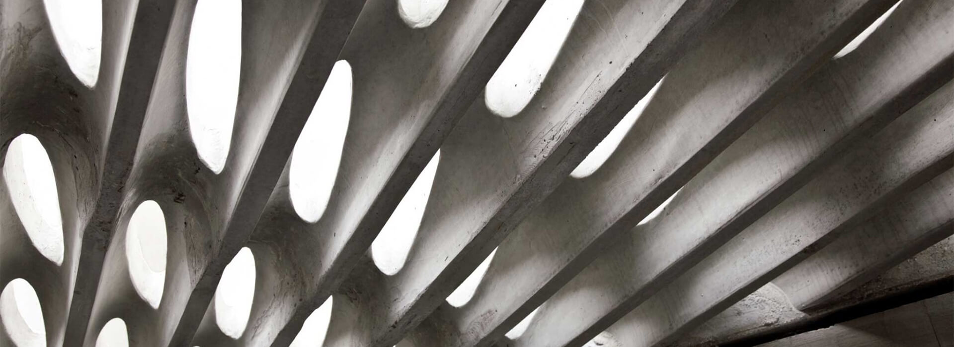
When teaching in the galleries, it is easy to become immersed in the art. And yet, when your attention is drawn to it, one becomes awestruck, again, by the simple beauty of the cast-in-place concrete that evokes natural forms, the elegant and complete intersections of the varying wall heights and joinery, and the raking light that gives life to the walls and illuminates the paintings. The natural light, and “natural setting,” give Still’s work a place to shine and his artistic voice to ring through, while also creating the kind of meditative, contemplative space where the works can be visited, known, again and again.
We’ve preserved the art galleries, as Still wished, for a direct, unmediated art viewing experience. Still, perhaps more than other abstract expressionists, desired an autonomy for the viewer: neither explanation nor titles can be found beside the work, encouraging you to look first and decide for yourself. If you find yourself at the museum wanting to know more about the man, his process, and his vocabulary, the artist’s own words are placed in text panels around the galleries. These quotes may enlighten or offer something to consider, but rarely explain.
Materials that may inform your knowledge about Still’s art—and perhaps the viewing experience—are distinctly separate from the art itself. The two floors of the museum were designed to separate the “information” experience from the art experience, while maintaining a cohesive museum experience. On the first level, visitors can enjoy one experience by watching the short videos on two “storyviewers,” use our interactive timeline to situate Still’s life and art amidst pop culture, art history, and historical events and examine the archives displays to discover more about the artist and the man from his own personal effects. Family guides with key questions that assist adults in looking at abstract expressionism with children are also available there.
This week, Doors Open Denver celebrates architecture and design. Join us at the Museum this weekend to explore the interplay between Still’s art and the museum architecture. Continue the conversation and let us know what you think online here on Still/Life.
